Toolbars, translation and keyboard use
RageLayer ships three ready-made toolbars — a React component, a Vue component and a custom element — and they are all thin renderers over one framework-neutral ToolbarModel. If you are building your own UI, that model is published too, so you get the behaviour without the markup.
| You are using | Import | What you get |
|---|---|---|
| React / Next.js | ragelayer/react | <RageLayer /> |
| Vue / Nuxt | ragelayer/vue | <RageLayer /> |
| Anything else | ragelayer/element | <rage-layer> |
| Your own UI | ragelayer/toolbar | ToolbarModel |
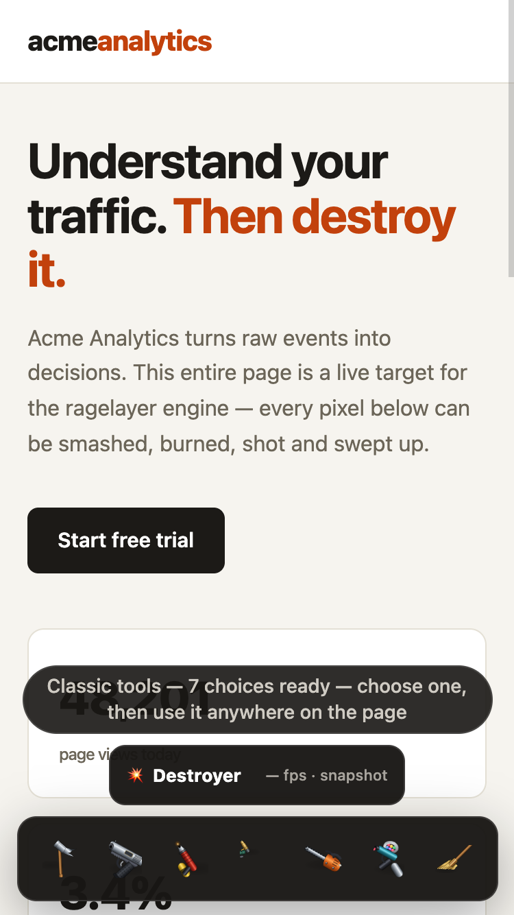
The built-in views keep the current control's name and gesture visible instead of asking visitors to decode icon silhouettes. On narrow screens the controls stay in one horizontally scrollable row, retain 44 px targets, and raise the guide text to 14 px.
The custom element
The custom element is the shortest path to a real toolbar on any stack — Svelte, Angular, Solid, Qwik, Astro, or plain HTML — because it is just an element.
<script type="module">
  import "ragelayer/element";
</script>

<rage-layer initial-tool="hammer" sound></rage-layer>
Importing the entry registers <rage-layer>. It builds its UI in a shadow root, so the host page's CSS cannot reach in and its own styles cannot leak out, and it disposes the engine when the element leaves the document.
Attributes cover the common cases (initial-tool, sound). For anything richer — a custom toolset, engine options, translated strings — call configure() before connecting it:
import { RageLayerElement } from "ragelayer/element";
import { hammer, gun } from "ragelayer/tools";

const rageLayer = new RageLayerElement();
rageLayer.configure({
  tools: [hammer, gun],
  history: true,
  strings: { close: "Dismiss" },
});
rageLayer.addEventListener("ragelayer-close", () => rageLayer.remove());
document.body.append(rageLayer);
The element emits ragelayer-close when the visitor presses the close button; hosts normally remove it in response. rageLayer.rageLayerEngine exposes the live engine.
Bundlers and the registration side effect
import "ragelayer/element" exists for its side effect. The package marks that one entry as having side effects, so tree-shaking will not drop it — but if your bundler is configured to ignore sideEffects, import defineRageLayerElement and call it explicitly instead.
The Vue component
<script setup lang="ts">
import { ref } from "vue";
import { RageLayer } from "ragelayer/vue";

const open = ref(false);
</script>

<template>
  <button @click="open = true">Destroy this page</button>
  <RageLayer v-if="open" @close="open = false" />
</template>
It renders nothing until it is mounted in a browser, so it is safe in a Nuxt page without <ClientOnly>, and it disposes its engine on unmount. @ready hands you the engine if you want to drive it yourself.
Building your own toolbar
ToolbarModel gives you the button list and every behaviour a RageLayer toolbar needs: which tool is selected, whether undo is available, the capture-status chip, keyboard shortcuts that correctly ignore typing and IME composition, roving focus, keyboard aiming, and snapshot export. Its state.hint is the current control's plain-language instruction; the built-in toolbars keep that instruction visible above the icons and update it on hover, focus, and keyboard navigation.
import { mountRageLayer } from "ragelayer";
import { ToolbarModel } from "ragelayer/toolbar";

const engine = mountRageLayer({ history: true, initialTool: null });
const toolbar = new ToolbarModel(engine, { onClose: () => engine.dispose() });

const unsubscribe = toolbar.subscribe((state) => {
  render({
    buttons: state.buttons.map((button) => ({
      label: button.label, // accessible name
      title: button.title, // tooltip, including the shortcut
      icon: button.icon, // a tool's drawn art, or null
      iconPath: button.iconPath, // an action's SVG path data, or undefined
      pressed: button.pressed,
      disabled: button.disabled,
      onClick: button.run,
    })),
    hint: state.hint, // visible instruction for the focused / hovered control
  });
});

window.addEventListener("keydown", (event) => {
  if (toolbar.handleKeyDown(event)) event.preventDefault();
});
Call toolbar.destroy() and unsubscribe() when your UI goes away. Disposing the engine destroys the model automatically.
Tool buttons carry icon, a data URL of the drawn art. Action buttons carry iconPath, SVG path data on a 24×24 grid drawn in currentColor — one colour token then moves a control's idle, hover and disabled states together, which platform-drawn emoji could not do. Render it yourself, or use the helpers:
import { TOOLBAR_ICONS, toolbarIconElement, toolbarIconSvg } from "ragelayer";

button.append(toolbarIconElement(state.iconPath)); // detached <svg> node
element.innerHTML = toolbarIconSvg(TOOLBAR_ICONS.snapshot); // markup

// TOOLBAR_ICONS also covers controls the built-in toolbar has no button for,
// such as pause and play.
Keyboard shortcuts
| Key | Action |
|---|---|
1–9, 0 | Select the first ten tools |
A | Enter keyboard aiming |
X | Collapse the page |
P | Save a picture of the wreckage |
R | Repair everything |
M | Toggle sound |
Esc | Put the tool away, then close |
Cmd/Ctrl+Z | Undo (when history is enabled) |
Cmd/Ctrl+Shift+Z | Redo |
Shortcuts never fire while the visitor is typing in an input, textarea, select or contenteditable, mid-IME-composition, or holding a key down.
Keyboard aiming
The toolbar has always been keyboard-operable, but the canvas is a pointer surface: without a mouse you could select the hammer and then do nothing with it. Aiming mode closes that gap.
Press A (or the crosshair button) with a tool in hand to place a high-contrast cursor in the middle of the viewport. Arrow keys move it, Enter or Space uses the tool there, and Esc leaves aiming without closing the toolbar. The page scrolls to follow the cursor, and every move and strike is announced in a live region.
Underneath, this is engine.strike(), which is public and worth knowing about even if you build your own UI:
// Use the active tool at a document point, with no pointer involved.
engine.strike(x, y);

// Tools that work while held — a flamethrower, a water hose — need a duration.
engine.strike(x, y, { holdMs: 400 });

// Draw the aiming cursor yourself, in document coordinates.
engine.setAim({ x, y });
engine.setAim(null);
strike runs the same onDown/onUp pair a click produces and takes a history checkpoint, so a keyboard-driven blow is undoable exactly like any other. Custom tools need no special handling to be reachable this way.
Translating and rewording
Every user-visible string the built-in UI produces can be replaced. This is how you translate the toy — and also how you match your own tone of voice.
import type { RageLayerStrings } from "ragelayer/toolbar";

const french: Partial<RageLayerStrings> = {
  toolbarLabel: "Outils de destruction",
  repair: "Tout réparer",
  close: "Fermer",
  keyboardCursor: "Viser avec les flèches",
  keyboardStruck: "{tool} utilisé à {x}, {y}",
  tools: {
    hammer: { name: "Marteau", hint: "frappez — les zones solides résistent" },
    broom: { name: "Balai", hint: "balayez pour nettoyer" },
  },
};
Pass it as strings to the React component, the Vue component, element.configure(), or new ToolbarModel(engine, { strings }). Anything you leave out keeps its English default, and any tool you do not name keeps its built-in name and hint. Placeholders in braces ({tool}, {x}, {y}) are substituted; unknown ones are left as written.
DEFAULT_STRINGS is exported if you want to see the full list, and resolveStrings() merges overrides the same way the components do.